
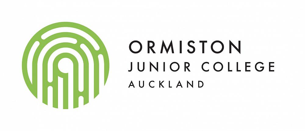
The OJC Logo Story
The OJC logo is both a symbol (tohu) of and an introduction to our school. It tells a story about the school and reveals some of the significant values which lay the foundation for relationships and learning for the OJC community.
Our logo was designed to be a visual representation of our vision statement;
“Guarantee every learner engages in innovative, personalised world class learning”
It was also designed to support our learners’ and community’s connection with the values of the school and with one another.
The logo has four dimensions:
Font (Ormiston Junior College)
Mark (the fingerprint)
Negative Spaces (the koru image)
Contemporary Whakairo Stylisation (the mark-making)
The image means different things to different people and can be interpreted in a number of ways. This was an intentional part of the design process and brief. The intention of this thinking is to reflect the nature of both engagement and personalisation in our school’s vision statement visually. This is done through the creation of an image that is associated with OJC exclusively, but also allows for meaning making and interpretation of the image by each viewer’s unique perspective.
Some key interpretations and intentions include the following images, messages and symbolism:
The Fingerprint
Fingerprints are a visual representation about our deepest levels of identity and individuality.
As each fingerprint is unique, so too is each learner.
Globally, Human hands have been used in various cultures as a means of identification. For example, in ancient China, fingerprints were used to sign or to autograph paintings. They are doubly valuable as "signatures" because they cannot be altered or forged, and the intricate patterns of whorls, circular and folded loops, and arches differ from finger to finger and from individual to individual.
As a person grows, his individual fingerprint patterns increase in size but do not change in geometric proportions.
The Koru
Korus and other forms of spirals are some of the most loved symbols of our artistic vocabulary.
They're found in the art of many cultures around the world and each of these cultures understands their significance and meaning differently.
The internal koru of our logo supports OJC to reflect not only the history of Maori and their kaupapa in Flat Bush and New Zealand, but also incorporates a cross-cultural symbol which has meaning for our multi-cultural community.
The Koru unfurls from the bottom opening of the logo up through the middle. Traditionally, the koru symbolises a new beginning and creation. This is significant for OJC as both a new school, but more importantly, as a junior college and double transition school whose focus on learner’s in the developmental phase of exploring their own identity in more depth in the early teen years is an important foundation for their success in the present and the future. The OJC koru is visually independent, complete, dynamic and moves purposefully through the overall design.
The circular shape of the koru conveys the idea of perpetual movement, while it’s inner coil, the corm with rolled up inner leaflets, suggests a return to the point of origin. In the larger scheme, this is a metaphor for the way in which life both changes and stays the same, a significant concept for the transition from childhood to young adulthood.
Some have determined that the koru also represents harmony. Between the chaos of change and calm of the everyday there is a point of equilibrium, a state of harmony in life. In its balanced shape the koru represents this.
The Contemporary Whakairo Stylisation:
Toi whakairo (art carving) or just whakairo (carving) is a Māori traditional art of carving.
The mark-making techniques are easily distinguishable, and provide an immediate visual reference to our connection and work with the Ngai Tai iwi to establish OJC.
By incorporating a contemporary reflection of the whakairo mark-making characteristics, the curved ends of each line mimicking the strokes of a chisel, we honour the relationship and collaboration with Ngai Tai in the creation of OJC.
This stylistic decision also helps us to connect the traditions of the past with innovations of the future.
(A huge thank-you to Mountain Jade New Zealand for their excellent descriptions of the significance of these elements of our logo)
Interpretations:
The circles and spirals of the OJC logo can also have multiple interpretations or connections which are both personal to each viewer or local to our area.
Some of these interpretations include references to our area’s topography, the lines of a map, the curved nature of the streets in our growing neighbourhood, the fibonacci sequence and golden spiral found in nature, space, and micro-sciences, and, of course, the round “O” for Ormiston and the beginning letter of our school and community name.
The potential uses and variations (such as colour or texture) of the school logo are as varied as the different experiences, events and activities available at OJC. The simple graphic of the logo has been intentionally created for the learning community’s use to reflect these things in ways that are significant to each use.
What does our logo mean to you?