FOUR RULES FOR USING ROTARY LOGOS CORRECTLY
Correct branding is important to every global brand and we must protect our name and intellectual property.
Article by PDG Sarita McLean, Rotary Public Image Coordinator
Correct branding is important to every global brand. Rotary is no different and like Coca-Cola, McDonald’s, Nike, and UNICEF, we must protect our name and intellectual property. It is how we can grow our organization, increase our impact, and maintain our reputation as an organization that can be trusted. Misuse of our logo only weakens our brand. Second, when a local club uses the Masterbrand Signature with their club’s name, they get credit for their good work in the community while leveraging the power of the Rotary’s global brand. And finally, our logo helps us tell Rotary’s story in a consistent and compelling way. It is our visual identity, no matter where you are in the world, if you see a Rotary club logo, you know that club is part of an international network of people of action.
Here are four key rules as to how Rotary’s logo should be used.
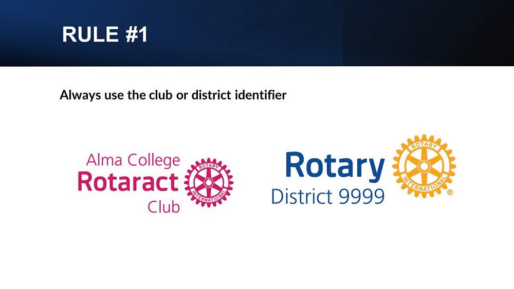
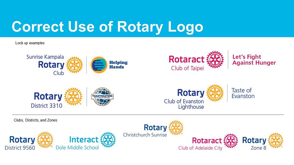
1. Always use the club or district identifier when using the Rotary logo. A club can use the name they are known by locally, adding their club’s name above or above and below the Masterbrand Signature. The layout you choose depends on how you say your club’s name. The position of the words and the wheel, and their size, are the same for every club.
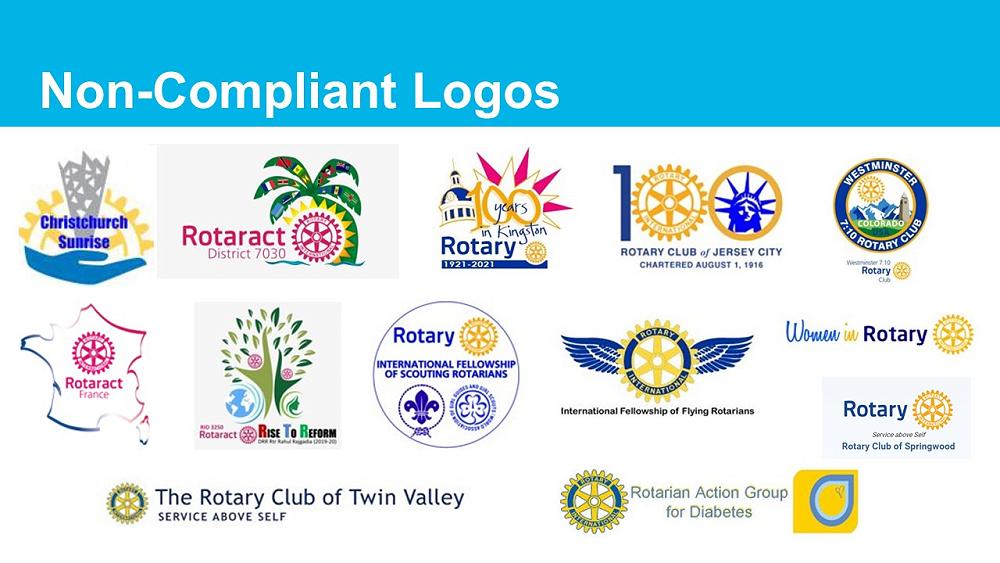
2. Never obscure the Rotary wheel, use a partial wheel, manipulate the wheel or use the wheel as an object in any way. The Mark of Excellence should only be used with the Masterbrand Signature. Do not manipulate Rotary’s logo by making it into a pancake, place it on top of an apple, as a bike wheel, or the number zero.

3. Do not use images or graphics within the Rotary logo. Nike would not add a tree behind their swoosh, nor should we add anything extra to the Rotary club logo.

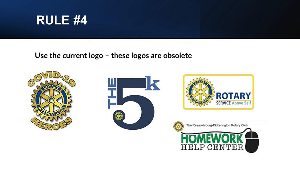
4. Replace your heritage logos with our new refreshed logos. We must tell a consistent story of who we are as members of Rotary, and what we do. That is our brand. Using the updated brand standards ensure we do that.
The use of various colors, fonts, and sizes, along with the alteration of the Mark of Excellence means there is no cohesion or unity. It can be hard to tell if it is relating to one organisation. And that can cause a potential member, donor or partner to doubt if we are an organization they can trust and whether they’d like to join, donate money to, or partner with. We need our rules when it comes to our logos so we can share a consistent story and message.
As always do not hesitate to reach out to the Zone Public Image team of Darryl Iseppi, Andy Marselos, Pauline Stewart, Ros Teirney, Malini Raghwan, Liz Courtney, Wayne Milnes, Barry Antees and myself if you need any help in the public image space. Our contact details are on the Rotary Zone 8 website under the Public Image tab. We’d love to hear from you.
Gallery
