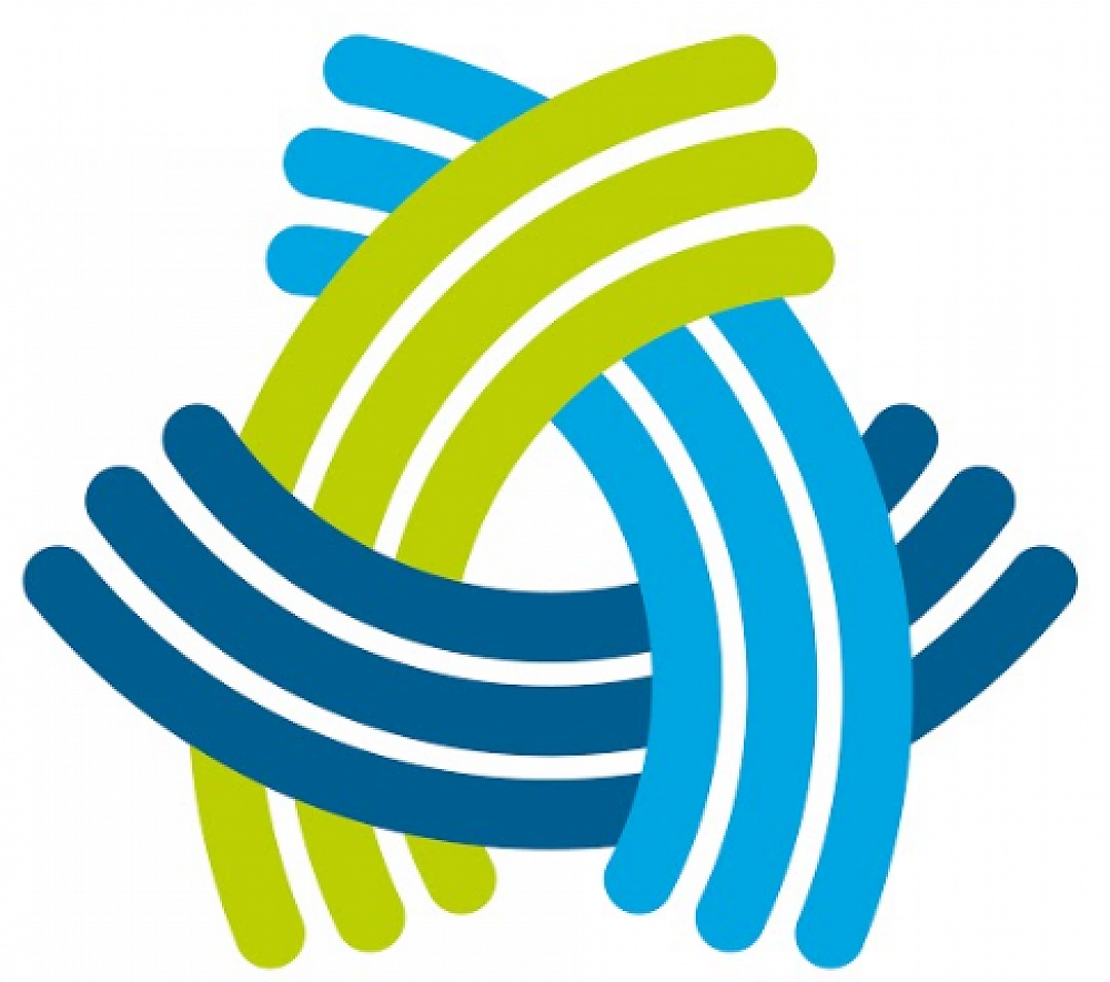
Our Logo
Our logo was designed by graphic designer Vicki Jordan and our Principal Tony Grey. The graphic logo has been carefully designed to symbolise many positive concepts.
Following is some of the background narrative:
The trio of coloured elements are all interconnected with an abstract woven pattern wherein each aspect lends and draws support from the other pieces around it. It is an important concept of supported strength and collaboration that symbolises various relationships:
- between the land, water and people
- Vision concepts of ‘inspire, challenge, empower’
- Maori, NZ European, the many other cultures of our school
- school, community, wider world
- parents, staff and students
- past, the present and the future.
The interwoven graphic also forms a loose letter ‘A’ for ‘Ao’ - the light. Similar to the way in which mountains rise from the land with a natural upwards force, the graphic represents Tāne (God of the forests and birds) pushing upwards and separating his parents, Papatūānuku (the earth mother) and Ranginui (the sky father), thereby allowing light to come into the natural world (the world of Te Ao Mārama)
A simple, fresh and vibrant colour theme has been carefully chosen to represent the natural world. Each of the colours of the logo are symbolic: light blue for sky (Ranginui), dark blue for water (lifeforce), and green for earth (Papatūānuku).
